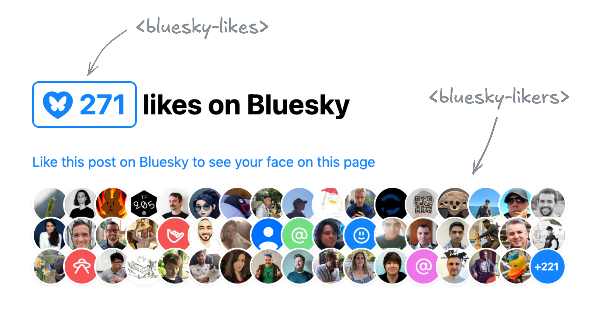
I set out to announce two components I wrote for displaying Bluesky likes and ended up ranting about the pain of building accessible, localizable web components in 2025. The components are still here, though — lucky you?
Just want the components? Here you go:
DemoRepoNPM
I’m old enough to remember the golden Web 2.0 era, when many of today’s big social media platforms grew up.
A simpler time, when the Web was much more extroverted.
It was common for websites to embed data from others (the peak of mashups),
and prominently feature widgets from various platforms to showcase a post’s likes or shares.
Especially Twitter was so ubiquitous that the number of Twitter shares was my primary metric for how much people were interested in a blog post I wrote.
Then, websites started progressively becoming walled gardens, guarding their data with more fervor than Gollum guarding the Precious.
Features disappeared or got locked behind API keys, ridiculous rate limits, expensive paywalls, and other restrictions.
Don’t get me wrong, I get it.
A lot of it was reactionary, a response to abuse — the usual reason we can’t have nice things.
And even when it was to stimulate profit — it is understandable that they want to monetize their platforms.
People gotta eat.
I was recently reading this interesting article by Salma Alam-Naylor.
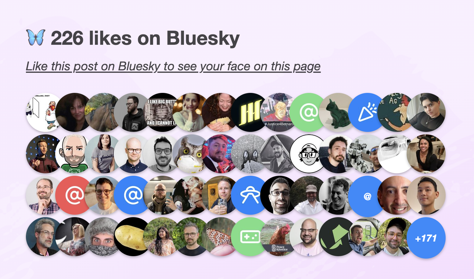
The article makes some great points, but it was something else that caught my eye: the widget of Bluesky likes at the bottom.
Salma's Bluesky likes widget that inspired these
I mentioned it to my trusty apprentice Dmitry who discovered the API was actually much simpler than what we’ve come to expect.
Later, it turned out Salma has even written an entire post on how to implement the same thing on your own site.
The openness of the API was so refreshing.
Not only can you read public data without being authenticated, you don’t even need an API key!
Major nostalgia vibes.
It seemed the perfect candidate for a web component that you can just drop in to a page, give it a post URL, and it will display the likes for that post.
I just had to make it, and of course use it right here.
How to emulate CSS contrast-color() using older CSS features, and the nasty dilemma between compliance and readability that the current state of the platform forces us into.
Out of all the CSS features I have designed,
Relative Colors aka Relative Color Syntax (RCS) is definitely among the ones I’m most proud of.
In a nutshell, they allow CSS authors to derive a new color from an existing color value by doing arbitrary math on color components
in any supported color space:
--color-lighter: hsl(from var(--color) h s calc(l * 1.2));
--color-lighterer: oklch(from var(--color) calc(l + 0.2) c h);
--color-alpha-50: oklab(from var(--color) l a b / 50%);
The elevator pitch was that by allowing lower level operations they provide authors flexibility on how to derive color variations,
giving us more time to figure out what the appropriate higher level primitives should be.
Even if my prediction is off, it already is available to 83% of users worldwide,
and if you sort its caniuse page by usage,
you will see the vast majority of the remaining 17% doesn’t come from Firefox,
but from older Chrome and Safari versions.
I think its current market share warrants production use today,
as long as we use @supports to make sure things work in non-supporting browsers, even if less pretty.
Most Relative Colors tutorials
revolve around its primary driving use cases:
making tints and shades or other color variations by tweaking a specific color component up or down,
and/or overriding a color component with a fixed value,
like the example above.
While this does address some very common pain points,
it is merely scratching the surface of what RCS enables.
This article explores a more advanced use case, with the hope that it will spark more creative uses of RCS in the wild.
One of the big longstanding CSS pain points is that it’s impossible to automatically specify a text color that is guaranteed to be readable on arbitrary backgrounds,
e.g. white on darker colors and black on lighter ones.
Why would one need that?
The primary use case is when colors are outside the CSS author’s control.
This includes:
User-defined colors. An example you’re likely familiar with: GitHub labels. Think of how you select an arbitrary color when creating a label and GitHub automatically picks the text color — often poorly (we’ll see why in a bit)
Colors defined by another developer. E.g. you’re writing a web component that supports certain CSS variables for styling.
You could require separate variables for the text and background, but that reduces the usability of your web component by making it more of a hassle to use.
Wouldn’t it be great if it could just use a sensible default, that you can, but rarely need to override?
GitHub Labels are an example where colors are user-defined, and the UI needs to pick a text color that works with them.
GitHub uses WCAG 2.1 to determine the text color, which is why (as we will see in the next section) the results are often poor.
Even in a codebase where every line of CSS code is controlled by a single author,
reducing couplings can improve modularity and facilitate code reuse.
The good news is that this is not going to be a pain point for much longer.
The CSS function contrast-color() was designed to address exactly that.
This is not new, you may have heard of it as color-contrast() before, an earlier name.
I recently drove consensus to scope it down to an MVP that addresses the most prominent pain points and can actually ship soonish,
as it circumvents some very difficult design decisions that had caused the full-blown feature to stall.
I then added it to the spec per WG resolution, though some details still need to be ironed out.
Glorious, isn’t it?
Of course, soonish in spec years is still, well, years.
As a data point, you can see in my past spec work that with a bit of luck (and browser interest), it can take as little as 2 years to get a feature shipped across all major browsers after it’s been specced.
When the standards work is also well-funded,
there have even been cases where a feature went from conception to baseline in 2 years,
with Cascade Layers being the poster child for this:
proposal by Miriam in Oct 2019,
shipped in every major browser by Mar 2022.
But 2 years is still a long time (and there are no guarantees it won’t be longer).
What is our recourse until then?
As you may have guessed from the title, the answer is yes.
It may not be pretty, but there is a way to emulate contrast-color() (or something close to it) using Relative Colors.
In the following we will use the OKLCh color space, which is the most perceptually uniformpolar color space that CSS supports.
Let’s assume there is a Lightness value above which black text is guaranteed to be readable regardless of the chroma and hue,
and below which white text is guaranteed to be readable.
We will validate that assumption later, but for now let’s take it for granted.
In the rest of this article, we’ll call that value the threshold and represent it as Lthreshold.
We will compute this value more rigously in the next section (and prove that it actually exists!),
but for now let’s use 0.7 (70%).
We can assign it to a variable to make it easier to tweak:
--l-threshold: 0.7;
Let’s work backwards from the desired result.
We want to come up with an expression that is composed of widely supported CSS math functions,
and will return 1 if L ≤ Lthreshold and 0 otherwise.
If we could write such an expression, we could then use that value as the lightness of a new color:
--l: /* ??? */;
color: oklch(var(--l) 0 0);
How could we simplify the task?
One way is to relax what our expression needs to return.
We don’t actually need an exact 0 or 1
If we can manage to find an expression that will give us 0 when L > Lthreshold
and > 1 when L ≤ Lthreshold,
we can just use clamp(0, /* expression */, 1) to get the desired result.
One idea would be to use ratios, as they have this nice property where they are > 1 if the numerator is larger than the denominator and ≤ 1 otherwise.
The ratio of is < 1 for L ≤ Lthreshold and > 1 when L > Lthreshold.
This means that will be a negative number for L < Lthreshold and a positive one for L > Lthreshold.
Then all we need to do is multiply that expression by a huge (in magnitude) negative number so that when it’s negative the result is guaranteed to be over 1.
One worry might be that if L gets close enough to the threshold we could get a number between 0 - 1,
but in my experiments this never happened, presumably since precision is finite.
Update (October 2026) Since sign() is Baseline 2025 we can simplify this expression further:
The last piece of the puzzle is to provide a fallback for browsers that don’t support RCS.
Update (October 2026) RCS is now Baseline 2024, and supported in 93.5% of browsers, so I unless you have an unusually wide browser support target, I think you can skip this.
We can use @supports with any color property and any relative color value as the test, e.g.:
In the previous section we’ve made a pretty big assumption:
That there is a Lightness value (Lthreshold) above which black text is guaranteed to be readable regardless of the chroma and hue,
and below which white text is guaranteed to be readable regardless of the chroma and hue.
But does such a value exist?
It is time to put this claim to the test.
When people first hear about perceptually uniform color spaces like Lab, LCH or their improved versions, OkLab and OKLCH,
they imagine that they can infer the contrast between two colors by simply comparing their L(ightness) values.
This is unfortunately not true, as contrast depends on more factors than perceptual lightness.
However, there is certainly significant correlation between Lightness values and contrast.
At this point, I should point out that while most web designers are aware of the WCAG 2.1 contrast algorithm,
which is part of the Web Content Accessibility Guidelines and baked into law in many countries,
it has been known for years that it produces extremely poor results.
So bad in fact that in some tests it performs almost as bad as random chance for any color that is not very light or very dark.
There is a newer contrast algorithm, APCA that produces far better results,
but is not yet part of any standard or legislation, and there have previously been some bumps along the way with making it freely available to the public (which seem to be largely resolved).
Some text
Some text
Which of the two seems more readable?
You may be surprised to find that the white text version fails WCAG 2.1,
while the black text version even passes WCAG AAA!
So where does that leave web authors?
In quite a predicament as it turns out.
It seems that the best way to create accessible color pairings right now is a two step process:
Use APCA to ensure actual readability
Compliance failsafe: Ensure the result does not actively fail WCAG 2.1.
I ran some quick experiments using Color.js
where I iterate over the OKLCh reference range (loosely based on the P3 gamut)
in increments of increasing granularity and calculate the lightness ranges for colors where white was the “best” text color (= produced higher contrast than black) and vice versa.
I also compute the brackets for each level (fail, AA, AAA, AAA+) for both APCA and WCAG.
I then turned my exploration into an interactive playground where you can run the same experiments yourself,
potentially with narrower ranges that fit your use case, or with higher granularity.
Calculating lightness ranges and contrast brackets for black and white on different background colors.
Note that these are the min and max L values for each level.
E.g. the fact that white text can fail WCAG when L ∈ [62.4%, 100%] doesn’t mean that every color with L > 62.4% will fail WCAG,
just that some do.
So, we can only draw meaningful conclusions by inverting the logic:
Since all white text failures are have an L ∈ [62.4%, 100%],
it logically follows that if L < 62.4%, white text will pass WCAG
regardless of what the color is.
By applying this logic to all ranges, we can draw similar guarantees for many of these brackets:
0% to 52.7%
52.7% to 62.4%
62.4% to 66.1%
66.1% to 68.7%
68.7% to 71.6%
71.6% to 75.2%
75.2% to 100%
Compliance WCAG 2.1
white
✅ AA
✅ AA
black
✅ AA
✅ AAA
✅ AAA
✅ AAA
✅ AAA
✅ AAA+
Readability APCA
white
😍 Best
😍 Best
😍 Best
🙂 OK
🙂 OK
black
🙂 OK
🙂 OK
😍 Best
Contrast guarantees we can infer for black and white text over arbitrary colors.
OK = passes but is not necessarily best.
You may have noticed that in general, WCAG has a lot of false negatives around white text,
and tends to place the Lightness threshold much lower than APCA.
This is a known issue with the WCAG algorithm.
Therefore, to best balance readability and compliance, we should use the highest threshold we can get away with.
This means:
If passing WCAG is a requirement, the highest threshold we can use is 62.3%.
If actual readability is our only concern, we can safely ignore WCAG and pick a threshold somewhere between 68.7% and 71.6%, e.g. 70%.
Here’s a demo so you can see how they both play out.
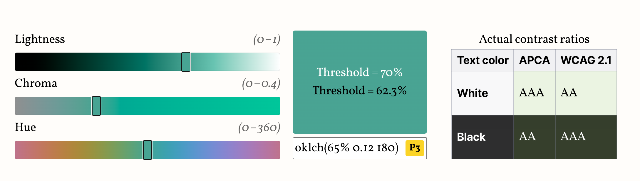
Edit the color below to see how the two thresholds work in practice, and compare with the actual contrast brackets, shown on the table next to (or below) the color picker.
Your browser does not support Relative Color Syntax, so the demo below will not work.
This is what it looks like in a supporting browser:
Lthreshold = 70%
Lthreshold = 62.3%
Actual contrast ratios
Text color
APCA
WCAG 2.1
White
Black
Avoid colors marked “P3+”, “PP” or “PP+”, as these are almost certainly outside your screen gamut,
and browsers currently do not gamut map properly, so the visual result will be off.
Note that if your actual color is more constrained (e.g. a subset of hues or chromas or a specific gamut),
you might be able to balance these tradeoffs better by using a different threshold.
Run the experiment yourself with your actual range of colors and find out!
Here are some examples of narrower ranges I have tried and the highest threshold that still passes WCAG 2.1:
It is particularly interesting that the threshold is improved to 64.5% by just ignoring colors that are not actually displayable on modern screens.
So, assuming (though sadly this is not an assumption that currently holds true) that browsers prioritize preserving lightness when gamut mapping, we could use 64.5% and still guarantee WCAG compliance.
You can even turn this into a utility class that you can combine with different thesholds:
When colors have sufficiently different lightness values (as happens with white or black text),
humans disregard chromatic contrast (the contrast that hue/colorfulness provide)
and basically only use lightness contrast to determine readability.
This is why L can be such a good predictor of whether white or black text works best.
But while OkLCh lightness is meant to closely track human lightness perception, many use cases require strict WCAG 2.0 compliance, due to legal or organizational requirements.
WCAG 2 color contrast guidelines actually use relative luminance rather than lightness (L) to determine readability.
If you absolutely need to meet WCAG, fear not, you can still use this!
Turns out, relative luminance is just the Y component in the XYZ D65 color space, which is natively supported in CSS.
So, instead of doing the math in oklch(), we’ll just do them in color(xyz) (or color(xyz-d65), same thing).
where (L_1) is the relative luminance of the lighter color and (L_2) is the relative luminance of the darker color.
Solving for the threshold where white and black tie, we get:
One complication is that white is not color(xyz 1 1 1) but color(xyz 0.9505 1 1.089) (the D65 white point), but aside from that it’s pretty straightforward:
This also has the advantage that it more closely tracks contrast-color() as currently implemented in browsers.
The big downside being the well-known problems with the WCAG 2 contrast algorithm, established above.
This guarantees passing WCAG AA. It does not guarantee WCAG AAA, since AAA (7:1) is unreachable for Y in (0.1, 0.3) with either white or black.
That’s inherent to WCAG, not to this code.
If you don’t have a hard requirement to meet WCAG 2.0 contrast ratios, I would not recommend using this as it produces suboptimal results compared to the oklch() formula.
This is only a start.
I can imagine many directions for improvement.
For example, we currently only calculate thresholds for white and black text.
However, in real designs, we rarely want pure black text.
How would this extend to darker tints of the background color?