Today I start a new chapter in my career.
After a decade at MIT, teaching and
doing research at the intersection of usability and programming language design,
I wrapped up my PhD two weeks ago
(yes, I’m a Dr now! And damn right I will — once it actually sinks in)
and today I start my new role as Product Lead at Font Awesome.
I will be evaluating user needs and improving product design and usability across all company products,
with an emphasis on Web Awesome,
the product we are launching early next year to revolutionize how Web UIs are built by using web components and CSS in ways you’ve never seen before.
Beyond improving the products themselves (all of which include extensive free & open source versions),
part of my role will utilize my web standards experience to collect web platform pain points from across the company and translating them to new and existing web standards proposals.
Yes, I know, it’s a match made in heaven. 😍
There is even a small chance I may have been the first to create an icon font for use in a web UI via @font-face,
which would make it even more wonderfully poetic that I’m joining the company that has become synonymous with icon fonts on the Web.
However, it was not my MIT PhD that led me to this role,
but an email from Dave Gandy (creator & CEO of Font Awesome) about Color.js,
that turned into hours of chats,
and eventually a job offer for a role I could not refuse, one that was literally molded around my skills and interests.
The role is not the only reason I’m excited to join Font Awesome, though.
The company itself is a breath of fresh air:
open source friendly (as Dave says, “literally the only reason we have Pro versions is that we need to sustain this somehow” 😅),
already profitable (= no scrambling to meet VC demands by cramming AI features nobody wants into our products),
fully remote, huge emphasis on work-life balance,
and an interview process that did not feel like an interview — or even a process.
In fact, they did not even want to look at my resume (despite my efforts 🤣).
It is telling that in their 10 years of existence, not a single person has left the company, and they have never had to let anyone go.
Moreover, it bridges the best of both worlds: despite having existed for a decade,
branching out to new products1I’ve always thought this was our most important deliverable, and pushed for prioritizing it. Recently, I even became editor of it. 🙃 and markets gives it a startup-like energy and excitement.
I had been extremely selective in the job opportunities I pursued, so it took a while to find the perfect role.
Having ADHD (diagnosed only last year — I want to write a blog post about that too at some point),
I knew it was crucial to find a job I could be passionate about:
ADHD folks are unstoppable machines in jobs they love (I have literally built my career by directing my hyperfocus to things that are actually productive),
but struggle way more than neurotypicals in jobs they hate.
It took a while, but when I started talking with Dave, I knew Font Awesome was it.
I’m still reeling from the mad rush of spending the past couple of months averaging 100-hour weeks to wrap up my PhD before starting,
but I couldn’t be more excited about this new chapter.
I’m hoping to write a series of blog posts in the coming weeks about about my journey to this point.
Things like:
How I decided that academia was not for me — but persisted to the finish line anyway because I’m stubborn AF 😅
How I realized that product work is my real calling, not software engineering per se (as much as I love both)
How I used web technologies instead of LaTeX to write my PhD thesis (and print it to PDF for submission), with 11ty plus several open source plugins, many of which I wrote, an ecosystem I hope to one day free more people from the tyranny of LaTeX (which was amazing in the 70s, but its ergonomics are now showing their age).
But for now, I just wanted to share the news, and go off to make the web more awesome — for everyone. 🚀
A few days ago, I gave a very well received talk about API design at dotJS titled “API Design is UI Design” 1I’ve always thought this was our most important deliverable, and pushed for prioritizing it. Recently, I even became editor of it. 🙃 .
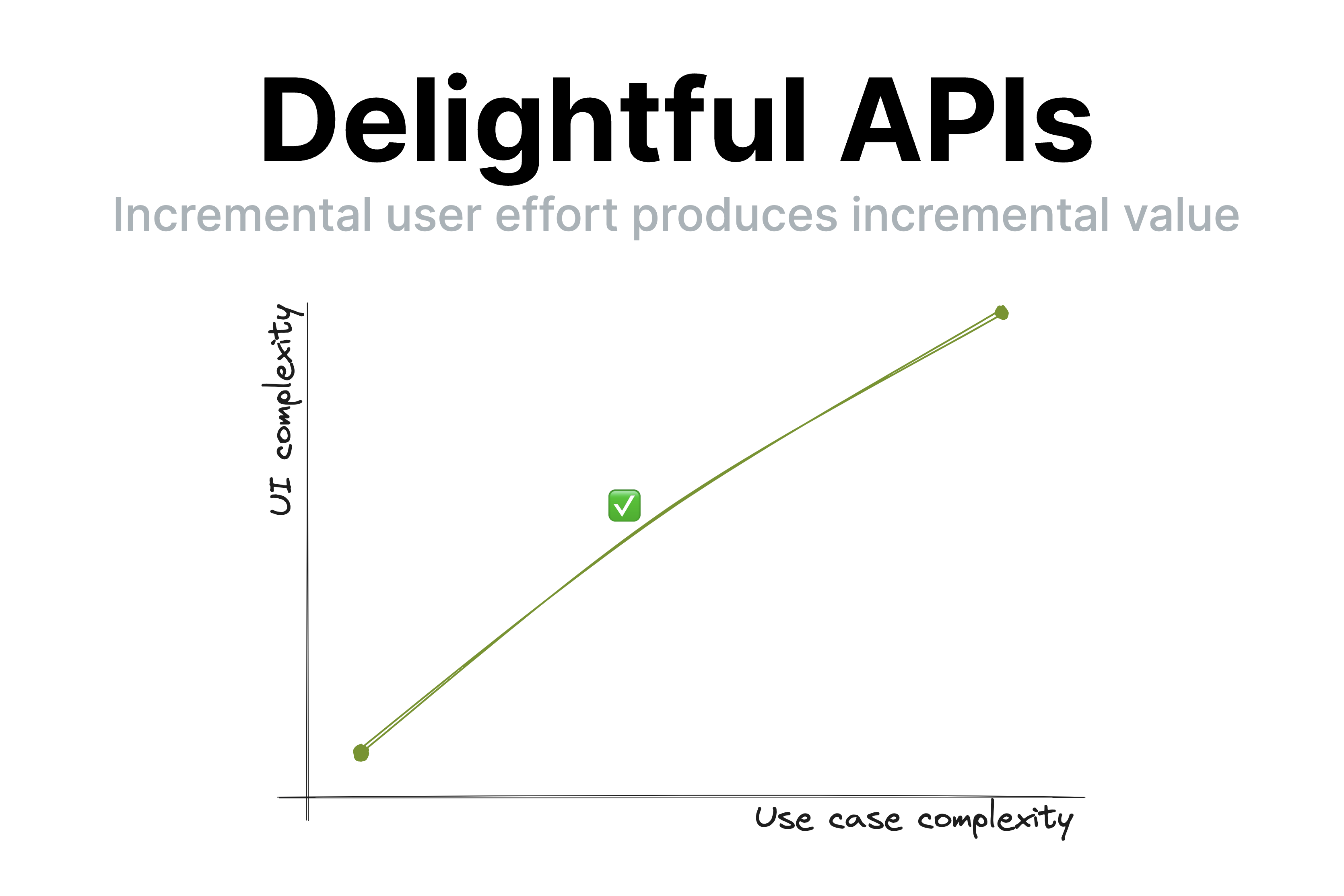
One of the points I made was that good UIs (and thus, good APIs) have a smooth UI complexity to Use case complexity curve.
This means that incremental user effort results in incremental value;
at no point going just a little bit further requires a disproportionately big chunk of upfront work 2I’m using product here in the general sense, of any software product, technology, or API, not just for-profit or commercial ones. .
Observing my daughter’s second ever piano lesson today made me realize how this principle extends to education and most other kinds of knowledge transfer (writing, presentations, etc.).
Her (generally wonderful) teacher spent 40 minutes teaching her notation, longer and shorter notes, practicing drawing clefs, etc.
Despite his playful demeanor and her general interest in the subject, she was clearly distracted by the end of it.
It’s easy to dismiss this as a 5 year old’s short attention span, but I could tell what was going on:
she did not understand why these were useful, nor how they connect to her end goal, which is to play music.
To her, notation was just an assortment of arbitrary symbols and lines, some of which she got to draw.
Note lengths were just isolated sounds with no connection to actual music.
Once I connected note lengths to songs she has sung with me and suggested they try something more hands on, her focus returned instantly.
I mentioned to her teacher that kids that age struggle to learn theory for that long without practicing it.
He agreed, and said that many kids are motivated to get through the theory because they’ve heard their teacher play nice music and want to get there too.
The thing is… sure, that’s motivating.
But as far as motivations go, it’s pretty weak.
Humans are animals, and animals don’t play the long game, or they would die.
We are programmed to optimize for quick, easy dopamine hits.
The farther into the future the reward, the more discipline it takes to stay motivated and put effort towards it.
This applies to all humans, but even more to kids and ADHD folks 3I often say that optimizing UX for people with ADHD actually creates delightful experiences even for those with neurotypical attention spans.
Just because you could focus your attention on something you don’t find interesting doesn’t mean you enjoy it.
Yet another case of accessibility helping everyone! .
That’s why it’s so hard for teenagers to study so they can improve their career opportunities and why you struggle to eat well and exercise so you can be healthy and fit.
So how does this apply to knowledge transfer?
It highlights how essential it is for students to
a) understand why what they are learning is useful and
b)put it in practice ASAP.
You can’t retain information that is not connected to an obvious purpose 4I mean, you can memorize anything if you try hard enough, but by optimizing teaching we can keep rote memorization down to the bare minimum. — your brain will treat it as noise and discard it.
The thing is, the more expert you are on a topic, the harder these are to do when conveying knowledge to others.
I get it. I’ve done it too.
First, the purpose of concepts feels obvious to you, so it’s easy to forget to articulate it.
You overestimate the student’s interest in the minutiae of your field of expertise.
Worse yet, so many concepts feel essential that you are convinced nothing is possible without learning them (or even if it is, it’s just not The Right Way™).
Looking back on some of my earlier CSS lectures, I’ve definitely been guilty of this.
As educators, it’s very tempting to say “they can’t possibly practice before understanding X, Y, Z, they must learn it properly”.
Except …they won’t.
At best they will skim over it until it’s time to practice, which is when the actual learning happens.
At worst, they will give up.
You will get much better retention if you frequently get them to see the value of their incremental imperfect knowledge
than by expecting a big upfront attention investment before they can reap the rewards.
There is another reason to avoid long chunks of upfront theory:
humans are goal oriented.
When we have a goal, we are far more motivated to absorb information that helps us towards that goal.
The value of the new information is clear, we are practicing it immediately, and it is already connected to other things we know.
This means that explaining things in context as they become relevant is infinitely better for retention and comprehension than explaining them upfront.
When knowledge is a solution to a problem the student is already facing, its purpose is clear, and it has already been filtered by relevance.
Furthermore, learning it provides immediate value and instant gratification: it explains what they are experiencing or helps them achieve an immediate goal.
Even if you don’t teach, this still applies to you.
I would go as far as to say it applies to every kind of knowledge transfer:
teaching, writing documentation, giving talks, even just explaining a tricky concept to your colleague over lunch break.
Literally any activity that involves interfacing with other humans benefits from empathy and understanding of human nature and its limitations.
To sum up:
Always explain why something is useful. Yes, even when it’s obvious to you.
Minimize the amount of knowledge you convey before the next opportunity to practice it.
For non-interactive forms of knowledge transfer (e.g. a book), this may mean showing an example,
whereas for interactive ones it could mean giving the student a small exercise or task.
Even in non-interactive forms, you can ask questions — the receiver will still pause and think what they would answer even if you are not there to hear it.
Prefer explaining in context rather than explaining upfront.
“Show, don’t tell”? Nah.
More like “Engage, don’t show”.
(In the interest of time, I’m posting this without citations to avoid going down the rabbit hole of trying to find the best source for each claim, especially since I believe they’re pretty uncontroversial in the psychology / cognitive science literature. That said, I’d love to add references if you have good ones!)
When it does, this is called a usability cliff. ↩︎
I often say that optimizing UX for people with ADHD actually creates delightful experiences even for those with neurotypical attention spans.
Just because you could focus your attention on something you don’t find interesting doesn’t mean you enjoy it.
Yet another case of accessibility helping everyone! ↩︎
I mean, you can memorize anything if you try hard enough, but by optimizing teaching we can keep rote memorization down to the bare minimum. ↩︎
The CSS WG resolved to add if() to CSS, but that won’t be in browsers for a while.
What are our options in the meantime?
A couple days ago, I posted about the recent CSS WG resolution to add an if() function to CSS.
Great as it may be, this is still a long way off, two years if everything goes super smoothly, more if not.
So what can you do when you need conditionals right now?
You may be pleased to find that you’re not completely out of luck.
There is a series of brilliant, horrible hacks that enable you to expose the kinds of higher level custom properties that conditionals typically enable.
The instinctive reaction many developers have when seeing hacks like these is “Nice hack, but can’t possibly ever use this in production”.
This sounds reasonable on the surface (keeping the codebase maintainable is a worthy goal!) but
when examined deeply, it reflects the wrong order of priorities,
prioritizing developer convenience over user convenience.
The TAG maintains a Web Platform Design Principles document 1I’ve always thought this was our most important deliverable, and pushed for prioritizing it. Recently, I even became editor of it. 🙃
that everyone designing APIs for the web platform is supposed to read and follow.
I’m a strong believer in having published Design Principles, for any product2I’m using product here in the general sense, of any software product, technology, or API, not just for-profit or commercial ones. .
They help stay on track, and remember what the big picture vision is, which is otherwise easy to lose sight of in the day to day minutiae.
One of the core principles in the document is the Priority of Constituencies.
The core of it is:
User needs come before the needs of web page authors, which come before the needs of user agent implementors, which come before the needs of specification writers, which come before theoretical purity.
Obviously in most projects there are far fewer stakeholders than for the whole web platform,
but the spirit of the principle still applies:
the higher the abstraction, the higher priority the user needs.
Or, in other words, consumers above producers.
For a more relatable example, in a web app using a framework like e.g. Vue and several Vue components,
the user needs of website users come before the needs of the web app developers,
which come before the needs of the developers of its Vue components,
which come before the needs of the Vue framework developers (sorry Evan :).
The TAG did not invent this principle; it is well known in UX and Product circles with a number of different wordings:
“Put the pain on those who can bear it”
Prefer internal complexity over external complexity
Why is that? Several reasons:
It is far easier to change the implementation than to change the user-facing API, so it’s worth making sacrifices to keep it clean from the get go.
Most products have way more users than developers, so this minimizes collective pain.
Internal complexity can be managed far more easily, with tooling or even good comments.
Managing complexity internally localizes it and contains it better.
Once the underlying platform improves, only one codebase needs to be changed to reap the benefits.
The corollary is that if hacks allow you to expose a nicer API to component users, it may be worth the increase in internal complexity (to a degree).
Just make sure that part of the code is well commented, and keep track of it so you can return to it once the platform has evolved to not require a hack anymore.
Like all principles, this isn’t absolute.
A small gain in user convenience is not a good tradeoff when it requires tremendous implementation complexity.
But it’s a good north star to follow.
As to whether custom properties are a better option to control styling than e.g. attributes,
I listed several arguments for that in my previous article.
Although, there are also cases where using custom properties is not a good idea…
In a nutshell, when the abstraction is likely to leak.
Ugliness is only acceptable if it’s encapsulated and not exposed to component users.
If there is a high chance they may come into contact with it, it might be a better idea to simply use attributes and call it a day.
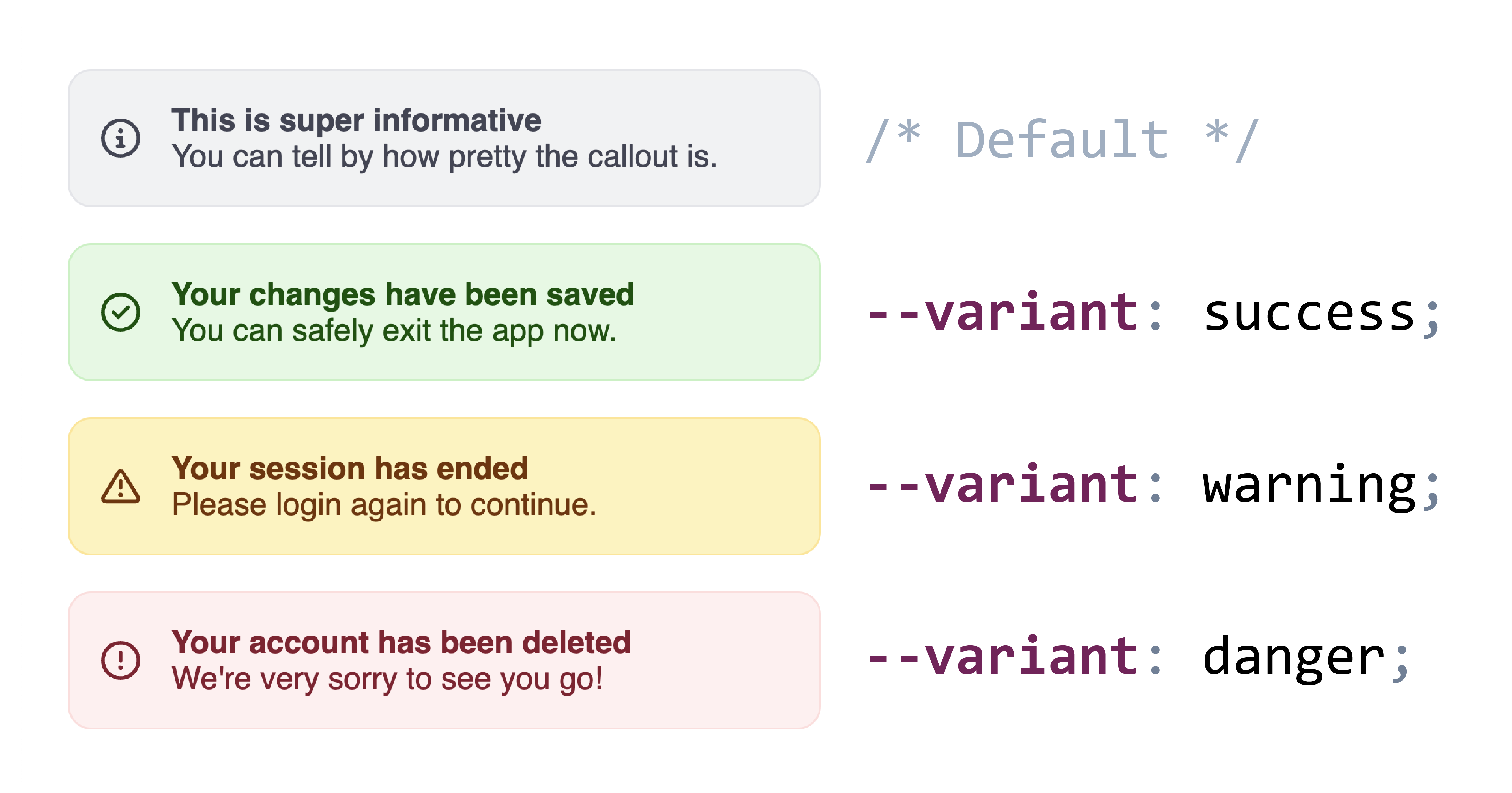
Example callouts with three variants.
In many of the examples below, I use variants as the canonical example of a custom property that a component may want to expose.
However, if component consumers may need to customize each variant, it may be better to use attributes so they can just use e.g. [variant="success"] instead of having to understand whatever crazy hack was used to expose a --variant custom property.
And even from a philosophical purity perspective, variants are on the brink of presentational vs semantic anyway.
There is a host of hacks and workarounds that people have come up with to make up for the lack of inline conditionals in CSS,
with the first ones dating back to as early as 2015.
However, instead of using this to map a range to another range,
we use it to map two points to two other points,
basically the two extremes of both ranges: and to select and respectively.
Back then, min() and max() were not available, so he had to divide each factor by an obscure constant to make it equal to 1 when it was not 0.
Once abs() ships this will be even simpler (the inner max() is basically getting the absolute value of N - var(--foo))
Ana Tudor also wrote about this in 2018, in this very visual article: DRY Switching with CSS Variables.
Pretty sure she was also using boolean algebra on these too (multiplication = AND, addition = OR), but I couldn’t find the exact post.
This was independently discovered by Ana Tudor (c. 2017),
Jane Ori in April 2020 (who gave it the name “Space Toggle”),
David Khoursid (aka David K Piano) in June 2020 (he called it prop-and-lock),
and yours truly in Oct 2020 (I called it the --var: ; hack, arguably the worst name of the three 😅).
The core idea is that var(--foo, fallback) is actually a very limited form of conditional: if --foo is initial (or IACVT), it falls back to fallback, otherwise it’s var(--foo).
Furthermore, we can set custom properties (or their fallbacks) to empty values to get them to be ignored when used as part of a property value.
It looks like this:
One of the downsides of this version is that it only supports two states per variable.
Note how we needed two variables for the two states.
Another downside is that there is no way to specify a fallback if none of the relevant variables are set.
In the example above, if neither --if-success nor --if-warning are set, the background declaration will be empty, and thus become IACVT which will make it transparent.
In 2023, Roma Komarov expanded the technique into what he called “Cyclic Dependency Space Toggles” which
addresses both limitations:
it supports any number of states,
and allows for a default value.
The core idea is that variables do not only become initial when they are not set, or are explicitly set to initial,
but also when cycles are encountered.
Roma’s technique depends on this behavior by producing cycles on all but one of the variables used for the values.
It looks like this:
A downside of this method is that since the values behind the --variant-success, --variant-warning, etc variables are specific to the --variant variable
they need to be namespaced to avoid clashes.
A big downside of most of these methods (except for the animation-based ones) is that you need to specify all values of the property in one place,
and the declaration gets applied whether your custom property has a value or not,
which makes it difficult to layer composable styles leading to some undesirable couplings.
Roma Komarov’s “Layered Toggles” method addresses this for some cases
by allowing us to decouple the different values by taking advantage of Cascade Layers.
The core idea is that Cascade Layers include a revert-layer keyword that will cause the current layer to be ignored wrt the declaration it’s used on.
Given that we can use unnamed layers, we can simply user a @layer {} rule for every block of properties we want to apply conditionally.
This approach does have some severe limitations which made it rather unpractical for my use cases.
The biggest one is that anything in a layer has lower priority than any unlayered styles,
which makes it prohibitive for many use cases.
Also, this doesn’t really simplify cyclic toggles, you still need to set all values in one place.
Still, worth a look as there are some use cases it can be helpful for.
The core idea behind this method is that paused animations (animation-play-state: paused) can still be advanced by setting animation-delay to a negative value.
For example in an animation like animation: 100s foo, you can access the 50% mark by setting animation-delay: -50s.
It’s trivial to transform raw numbers to <time> values, so this can be abstracted to plain numbers for the user-facing API.
Here is a simple example to illustrate how this works:
This is merely to illustrate the core idea, having a --variant property that takes numbers is not a good API!
Though the numbers could be aliased to variables, so that users would set --variant: var(--success).
This technique seems to have been first documented by me in 2015, during a talk about …pie charts
(I would swear I showed it in an earlier talk but I cannot find it).
I never bothered writing about it, but someone else did, 4 years later.
To ensure you don’t get slightly interpolated values due to precision issues, you could also slap a steps() in there:
This is especially useful when 100 divided by your number of values produces repeating decimals,
e.g. 3 steps means your keyframes are at increments of 33.33333%.
A benefit of this method is that defining each state is done with regular declarations, not involving any weirdness,
and that .
It does also have some obvious downsides:
Values restricted to numbers
Takes over the animation property, so you can’t use it for actual animations.
So far all of these methods impose constraints on the API exposed by these custom properties:
numbers by the linear interpolation method and weird values that have to be hidden behind variables
for the space toggle and cyclic toggle methods.
In October 2022, Jane Ori was the first one to discover a method that actually allows us to support plain keywords,
which is what the majority of these use cases needs.
She called it “CSS-Only Type Grinding”.
Its core idea is if a custom property is registered (via either @property or CSS.registerProperty()),
assigning values to it that are not valid for its syntax makes it IACVT (Invalid at computed value time) and it falls back to its initial (or inherited) value.
She takes advantage of that to progressively transform keywords to other keywords or numbers through a series of intermediate registered custom properties,
each substituting one more value for another.
I was recently independently experimenting with a similar idea.
It started from a use case of one of my components where I wanted to implement a --size property with two values: normal and large.
Style queries could almost get me there, but I also needed to set flex-flow: column on the element itself when --size was large.
The end result takes N + 1 @property rules, where N is the number of distinct values you need to support.
The first one is the rule defining the syntax of your actual property:
We can also transform keywords to numbers, by replacing successive keywords with <integer> in the syntax, one at a time, with different initial values each time.
Here is the --variant example using this method:
In 2018, Roma Komarov discovered another method that allows plain keywords to be used as the custom property API,
forgot about it, then rediscovered it in June 2023 😅.
He still never wrote about it, so these codepens are the only documentation we have.
It’s a variation of the previous method: instead of using a single @keyframes rule and switching between them via animation-delay,
define several separate @keyframes rules, each named after the keyword we want to use:
Every one of these methods has limitations, some of which are inerent in its nature, but others can be improved upon.
In this section I will discuss some improvements that me or others have thought of.
I decided to include these in a separate section, since they affect more than one method.
A big downside with the animation-based approaches (3 and 5) is the place of animations in the cascade:
properties applied via animation keyframes can only be overridden via other animations or !important.
One way to deal with that is to set custom properties in the animation keyframes, that you apply in regular rules.
To use the example from Variable animation name:
Note that you can combine the two approaches (variable animation-name and paused animations)
when you have two custom properties where each state of the first corresponds to N distinct states of the latter.
For example, a --variant that sets colors, and a light/dark mode within each variant that sets different colors.
Another downside of the animation-based approaches is that they take over the animation property.
If authors want to apply an animation to your component, suddenly a bunch of unrelated things stop working, which is not great user experience.
There isn’t that much to do here to prevent this experience, but you can at least offer a way out:
instead of defining your animations directly on animation, define them on a custom property, e.g. --core-animations.
Then, if authors want to apply their own animations, they just make sure to also include var(--core-animations) before or after.
Many of the approaches above are based on numerical values, which are then mapped to the value we actually want.
For numbers or dimensions, this is easy.
But what about colors?
I linked to Noah Liebman’s post above on recursive color-mix(),
where he presents a rather complex method to select among a continuous color scale based on a 0-1 number.
However, if you don’t care about any intermediate colors and just want to select among a few discrete colors, the method can be a lot simpler.
Simple enough to be specified inline.
Let me explain: Since color-mix() only takes two colors, we need to nest them to select among more than 2, no way around that.
However, the percentages we calculate can be very simple: 100% when we want to select the first color and 0% otherwise.
I plugged these numbers into my CSS range mapping tool
(example) and noticed a pattern:
If we want to output 100% when our variable (e.g. --variant-index) is N-1 and 0% when it’s N, we can use 100% * (N - var(--variant-index)).
And here is a more realistic one, using the Type Grinding method to transform keywords to numbers, and then using the above technique to select among 4 colors for backgrounds and borders (codepen).
There are two components to each method: the input values it supports, i.e. your custom property API that you will expose, e.g. numbers, keywords, etc.,
and the output values it supports (<dimension>, keywords, etc.).
If we can transform the input values of one method to the input values of another, we can mix and match approaches to maximize flexibility.
For example, we can use type grinding to transform keywords to numbers, and then use paused animations or binary linear interpolation to select among a number of quantitative values based on that number.
Keywords → Numbers
Type grinding
Numbers → Keywords
We can use paused animations to select among a number of keywords based on a number (which we transform to a negative animation-delay).
Impractical outside of Shadow DOM due to name clashes
Takes over animation property
Cascade weirdness
The most important consideration is the API we want to expose to component users.
After all, exposing a nicer API is the whole point of this, right?
If your custom property makes sense as a number without degrading usability
(e.g. --size may make sense as a number, but small | medium | large is still better than 0 | 1 | 2),
then Binary Linear Interpolation is probably the most flexible method to start with,
and as we have seen in Combining approaches section, numbers can be converted to inputs for every other method.
Between the two, Type Grinding is the one providing the best encapsulation,
since it relies entirely on custom properties and does not hijack any native properties.
Unfortunately, the fact that @property is not yet supported in Shadow DOM throws a spanner in the works,
but since these intermediate properties are only used for internal calculations,
we can just give them obscure names and insert them in the light DOM.
Phew! That was a long one. If you’re aware of any other techniques, let me know so I can add them.
And I think after all of this, if you had any doubt that we need if() in CSS,
the sheer number and horribleness of these hacks must have dispelled it by now. 😅
Thanks to Roma Komarov for reviewing earlier drafts of this article.
2 footnotes
I’ve always thought this was our most important deliverable, and pushed for prioritizing it. Recently, I even became editor of it. 🙃 ↩︎
I’m using product here in the general sense, of any software product, technology, or API, not just for-profit or commercial ones. ↩︎
Last week, the CSS WG resolved to add an inline if() to CSS.
But what does that mean, and why is it exciting?
Last week, we had a CSS WG face-to-face meeting in A Coruña, Spain.
There is one resolution from that meeting that I’m particularly excited about:
the consensus to add an inline if() to CSS.
While I was not the first to propose an inline conditional syntax,
I did try and scope down the various nonterminating discussions into an MVP that can actually be implemented quickly,
discussed ideas with implemenators,
and eventually published a concrete proposal and pushed for group resolution.
Quite poetically, the relevant discussion occurred on my birthday, so in a way, I got if() as the most unique birthday present ever. 😀
This also comes to show that proposals being rejected is not the end-all for a given feature.
It is in fact quite common for features to be rejected for several times before they are accepted: CSS Nesting, :has(), container queries were all simply the last iteration in a series of rejected proposals.
if() itself was apparently rejected in 2018 with very similar syntax to what I proposed.
What was the difference? Style queries had already shipped, and we could simply reference the same syntax for conditions (plus media() and supports() from Tab’s @when proposal) whereas in the 2018 proposal how conditions would work was largely undefined.
I posted about this on a variety of social media, and the response by developers has been overwhelmingly positive:
I even had friends from big companies writing to tell me their internal Slacks blew up about it.
This proves what I’ve always suspected, and was part of the case I made to the CSS WG: that this is a huge pain point.
Hopefully the amount and intensity of positive reactions will help browsers prioritize this feature and add it to their roadmaps earlier rather than later.
Across all these platforms, besides the “I can’t wait for this to ship!” sentiment being most common,
there were a few other recurring questions and a fair bit of confusion that I figured were worth addressing.
How to emulate CSS contrast-color() using older CSS features, and the nasty dilemma between compliance and readability that the current state of the platform forces us into.
Out of all the CSS features I have designed,
Relative Colors aka Relative Color Syntax (RCS) is definitely among the ones I’m most proud of.
In a nutshell, they allow CSS authors to derive a new color from an existing color value by doing arbitrary math on color components
in any supported color space:
--color-lighter: hsl(from var(--color) h s calc(l * 1.2));
--color-lighterer: oklch(from var(--color) calc(l + 0.2) c h);
--color-alpha-50: oklab(from var(--color) l a b / 50%);
The elevator pitch was that by allowing lower level operations they provide authors flexibility on how to derive color variations,
giving us more time to figure out what the appropriate higher level primitives should be.
Even if my prediction is off, it already is available to 83% of users worldwide,
and if you sort its caniuse page by usage,
you will see the vast majority of the remaining 17% doesn’t come from Firefox,
but from older Chrome and Safari versions.
I think its current market share warrants production use today,
as long as we use @supports to make sure things work in non-supporting browsers, even if less pretty.
Most Relative Colors tutorials
revolve around its primary driving use cases:
making tints and shades or other color variations by tweaking a specific color component up or down,
and/or overriding a color component with a fixed value,
like the example above.
While this does address some very common pain points,
it is merely scratching the surface of what RCS enables.
This article explores a more advanced use case, with the hope that it will spark more creative uses of RCS in the wild.
One of the big longstanding CSS pain points is that it’s impossible to automatically specify a text color that is guaranteed to be readable on arbitrary backgrounds,
e.g. white on darker colors and black on lighter ones.
Why would one need that?
The primary use case is when colors are outside the CSS author’s control.
This includes:
User-defined colors. An example you’re likely familiar with: GitHub labels. Think of how you select an arbitrary color when creating a label and GitHub automatically picks the text color — often poorly (we’ll see why in a bit)
Colors defined by another developer. E.g. you’re writing a web component that supports certain CSS variables for styling.
You could require separate variables for the text and background, but that reduces the usability of your web component by making it more of a hassle to use.
Wouldn’t it be great if it could just use a sensible default, that you can, but rarely need to override?
GitHub Labels are an example where colors are user-defined, and the UI needs to pick a text color that works with them.
GitHub uses WCAG 2.1 to determine the text color, which is why (as we will see in the next section) the results are often poor.
Even in a codebase where every line of CSS code is controlled by a single author,
reducing couplings can improve modularity and facilitate code reuse.
The good news is that this is not going to be a pain point for much longer.
The CSS function contrast-color() was designed to address exactly that.
This is not new, you may have heard of it as color-contrast() before, an earlier name.
I recently drove consensus to scope it down to an MVP that addresses the most prominent pain points and can actually ship soonish,
as it circumvents some very difficult design decisions that had caused the full-blown feature to stall.
I then added it to the spec per WG resolution, though some details still need to be ironed out.
Glorious, isn’t it?
Of course, soonish in spec years is still, well, years.
As a data point, you can see in my past spec work that with a bit of luck (and browser interest), it can take as little as 2 years to get a feature shipped across all major browsers after it’s been specced.
When the standards work is also well-funded,
there have even been cases where a feature went from conception to baseline in 2 years,
with Cascade Layers being the poster child for this:
proposal by Miriam in Oct 2019,
shipped in every major browser by Mar 2022.
But 2 years is still a long time (and there are no guarantees it won’t be longer).
What is our recourse until then?
As you may have guessed from the title, the answer is yes.
It may not be pretty, but there is a way to emulate contrast-color() (or something close to it) using Relative Colors.
In the following we will use the OKLCh color space, which is the most perceptually uniformpolar color space that CSS supports.
Let’s assume there is a Lightness value above which black text is guaranteed to be readable regardless of the chroma and hue,
and below which white text is guaranteed to be readable.
We will validate that assumption later, but for now let’s take it for granted.
In the rest of this article, we’ll call that value the threshold and represent it as Lthreshold.
We will compute this value more rigously in the next section (and prove that it actually exists!),
but for now let’s use 0.7 (70%).
We can assign it to a variable to make it easier to tweak:
--l-threshold: 0.7;
Let’s work backwards from the desired result.
We want to come up with an expression that is composed of widely supported CSS math functions,
and will return 1 if L ≤ Lthreshold and 0 otherwise.
If we could write such an expression, we could then use that value as the lightness of a new color:
--l: /* ??? */;
color: oklch(var(--l) 0 0);
How could we simplify the task?
One way is to relax what our expression needs to return.
We don’t actually need an exact 0 or 1
If we can manage to find an expression that will give us 0 when L > Lthreshold
and > 1 when L ≤ Lthreshold,
we can just use clamp(0, /* expression */, 1) to get the desired result.
One idea would be to use ratios, as they have this nice property where they are > 1 if the numerator is larger than the denominator and ≤ 1 otherwise.
The ratio of is < 1 for L ≤ Lthreshold and > 1 when L > Lthreshold.
This means that will be a negative number for L < Lthreshold and a positive one for L > Lthreshold.
Then all we need to do is multiply that expression by a huge (in magnitude) negative number so that when it’s negative the result is guaranteed to be over 1.
One worry might be that if L gets close enough to the threshold we could get a number between 0 - 1,
but in my experiments this never happened, presumably since precision is finite.
Update (October 2026) Since sign() is Baseline 2025 we can simplify this expression further:
The last piece of the puzzle is to provide a fallback for browsers that don’t support RCS.
Update (October 2026) RCS is now Baseline 2024, and supported in 93.5% of browsers, so I unless you have an unusually wide browser support target, I think you can skip this.
We can use @supports with any color property and any relative color value as the test, e.g.:
In the previous section we’ve made a pretty big assumption:
That there is a Lightness value (Lthreshold) above which black text is guaranteed to be readable regardless of the chroma and hue,
and below which white text is guaranteed to be readable regardless of the chroma and hue.
But does such a value exist?
It is time to put this claim to the test.
When people first hear about perceptually uniform color spaces like Lab, LCH or their improved versions, OkLab and OKLCH,
they imagine that they can infer the contrast between two colors by simply comparing their L(ightness) values.
This is unfortunately not true, as contrast depends on more factors than perceptual lightness.
However, there is certainly significant correlation between Lightness values and contrast.
At this point, I should point out that while most web designers are aware of the WCAG 2.1 contrast algorithm,
which is part of the Web Content Accessibility Guidelines and baked into law in many countries,
it has been known for years that it produces extremely poor results.
So bad in fact that in some tests it performs almost as bad as random chance for any color that is not very light or very dark.
There is a newer contrast algorithm, APCA that produces far better results,
but is not yet part of any standard or legislation, and there have previously been some bumps along the way with making it freely available to the public (which seem to be largely resolved).
Some text
Some text
Which of the two seems more readable?
You may be surprised to find that the white text version fails WCAG 2.1,
while the black text version even passes WCAG AAA!
So where does that leave web authors?
In quite a predicament as it turns out.
It seems that the best way to create accessible color pairings right now is a two step process:
Use APCA to ensure actual readability
Compliance failsafe: Ensure the result does not actively fail WCAG 2.1.
I ran some quick experiments using Color.js
where I iterate over the OKLCh reference range (loosely based on the P3 gamut)
in increments of increasing granularity and calculate the lightness ranges for colors where white was the “best” text color (= produced higher contrast than black) and vice versa.
I also compute the brackets for each level (fail, AA, AAA, AAA+) for both APCA and WCAG.
I then turned my exploration into an interactive playground where you can run the same experiments yourself,
potentially with narrower ranges that fit your use case, or with higher granularity.
Calculating lightness ranges and contrast brackets for black and white on different background colors.
Note that these are the min and max L values for each level.
E.g. the fact that white text can fail WCAG when L ∈ [62.4%, 100%] doesn’t mean that every color with L > 62.4% will fail WCAG,
just that some do.
So, we can only draw meaningful conclusions by inverting the logic:
Since all white text failures are have an L ∈ [62.4%, 100%],
it logically follows that if L < 62.4%, white text will pass WCAG
regardless of what the color is.
By applying this logic to all ranges, we can draw similar guarantees for many of these brackets:
0% to 52.7%
52.7% to 62.4%
62.4% to 66.1%
66.1% to 68.7%
68.7% to 71.6%
71.6% to 75.2%
75.2% to 100%
Compliance WCAG 2.1
white
✅ AA
✅ AA
black
✅ AA
✅ AAA
✅ AAA
✅ AAA
✅ AAA
✅ AAA+
Readability APCA
white
😍 Best
😍 Best
😍 Best
🙂 OK
🙂 OK
black
🙂 OK
🙂 OK
😍 Best
Contrast guarantees we can infer for black and white text over arbitrary colors.
OK = passes but is not necessarily best.
You may have noticed that in general, WCAG has a lot of false negatives around white text,
and tends to place the Lightness threshold much lower than APCA.
This is a known issue with the WCAG algorithm.
Therefore, to best balance readability and compliance, we should use the highest threshold we can get away with.
This means:
If passing WCAG is a requirement, the highest threshold we can use is 62.3%.
If actual readability is our only concern, we can safely ignore WCAG and pick a threshold somewhere between 68.7% and 71.6%, e.g. 70%.
Here’s a demo so you can see how they both play out.
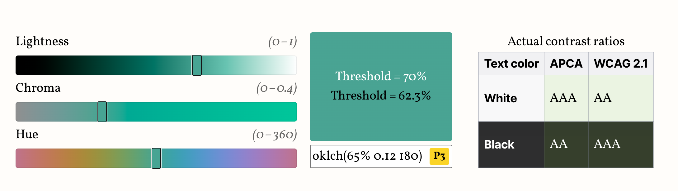
Edit the color below to see how the two thresholds work in practice, and compare with the actual contrast brackets, shown on the table next to (or below) the color picker.
Your browser does not support Relative Color Syntax, so the demo below will not work.
This is what it looks like in a supporting browser:
Lthreshold = 70%
Lthreshold = 62.3%
Actual contrast ratios
Text color
APCA
WCAG 2.1
White
Black
Avoid colors marked “P3+”, “PP” or “PP+”, as these are almost certainly outside your screen gamut,
and browsers currently do not gamut map properly, so the visual result will be off.
Note that if your actual color is more constrained (e.g. a subset of hues or chromas or a specific gamut),
you might be able to balance these tradeoffs better by using a different threshold.
Run the experiment yourself with your actual range of colors and find out!
Here are some examples of narrower ranges I have tried and the highest threshold that still passes WCAG 2.1:
It is particularly interesting that the threshold is improved to 64.5% by just ignoring colors that are not actually displayable on modern screens.
So, assuming (though sadly this is not an assumption that currently holds true) that browsers prioritize preserving lightness when gamut mapping, we could use 64.5% and still guarantee WCAG compliance.
You can even turn this into a utility class that you can combine with different thesholds:
When colors have sufficiently different lightness values (as happens with white or black text),
humans disregard chromatic contrast (the contrast that hue/colorfulness provide)
and basically only use lightness contrast to determine readability.
This is why L can be such a good predictor of whether white or black text works best.
But while OkLCh lightness is meant to closely track human lightness perception, many use cases require strict WCAG 2.0 compliance, due to legal or organizational requirements.
WCAG 2 color contrast guidelines actually use relative luminance rather than lightness (L) to determine readability.
If you absolutely need to meet WCAG, fear not, you can still use this!
Turns out, relative luminance is just the Y component in the XYZ D65 color space, which is natively supported in CSS.
So, instead of doing the math in oklch(), we’ll just do them in color(xyz) (or color(xyz-d65), same thing).
where (L_1) is the relative luminance of the lighter color and (L_2) is the relative luminance of the darker color.
Solving for the threshold where white and black tie, we get:
One complication is that white is not color(xyz 1 1 1) but color(xyz 0.9505 1 1.089) (the D65 white point), but aside from that it’s pretty straightforward:
This also has the advantage that it more closely tracks contrast-color() as currently implemented in browsers.
The big downside being the well-known problems with the WCAG 2 contrast algorithm, established above.
This guarantees passing WCAG AA. It does not guarantee WCAG AAA, since AAA (7:1) is unreachable for Y in (0.1, 0.3) with either white or black.
That’s inherent to WCAG, not to this code.
If you don’t have a hard requirement to meet WCAG 2.0 contrast ratios, I would not recommend using this as it produces suboptimal results compared to the oklch() formula.
This is only a start.
I can imagine many directions for improvement.
For example, we currently only calculate thresholds for white and black text.
However, in real designs, we rarely want pure black text.
How would this extend to darker tints of the background color?